
HOW TO CHOOSE COLORS FOR WINTER
Winter is a challenging time for personal style. The cold weather, shorter days, and muted landscape often push us to retreat into a uniform of dark, neutral tones.
Many women find themselves feeling dull or uninspired, wondering why their wardrobe doesn’t uplift them when they need it most.
If this sounds familiar, you’re not alone—but there’s a way to bring radiance and joy back to your winter outfits.
The Problem: Feeling Washed Out and Invisible
Winter wardrobes are often dominated by blacks, grays, and navy blues.
While practical and safe, these colors can clash with your natural complexion, leaving you looking tired or washed out.

Contrary to stylists referring to these colors as "universal neutrals", there are no universal colors in science.
And especially for neutral colors, it is crucial to know your True Color Type, which is based on your Root Skin Color (not on your undertones - a concept that doesn´t exist in science).
The lack of vibrancy in winter clothing collections compounds the issue, making it seem like you have no choice but to blend in with the season's dreary palette.
You might feel like no matter what you buy, it doesn’t quite work for you.
Maybe you’ve tried to follow seasonal trends or add pops of color, only to find that they don’t feel cohesive or flattering.

The reasons can be the hue, chroma, depth, or contrast that creates dissonance with your natural coloring and thus makes you feel like you are not like yourself, like you are wearing a mask.
Some colors can create a harsh barrier between your coloring, and thus, people start treating you differently, oftentimes negatively.
This cycle creates self-harming patterns in your brain, and you start talking negatively about yourself, body-shaming yourself, even though nothing is wrong with you.

Here is where colors have a deep influence on our subconscious minds and create a perception and self-image that results in certain behaviors and further color choices that dim your light and beauty, especially during wintertime when the mood is generally lower than during summertime (due to Vitamin D levels).
Why Your Past Attempts Have Failed
Overreliance on Trends
Seasonal trends often dictate what colors are “in,” but those shades aren’t universally flattering. Following them without considering your unique coloring leads to disappointment every time.
Generic Advice About Winter Dressing
You’ve probably heard generic tips like “add a scarf for color” or “stick to jewel tones,” but such advice doesn’t consider your color type.
And so you end up in an endless loop of trial and error without hope for success.

Defaulting to Neutrals
While neutrals feel safe, they can be highly unflattering if their hues clash with your Root Skin Color.

Common Misconceptions About Winter Colors
“Winter means darker colors.”
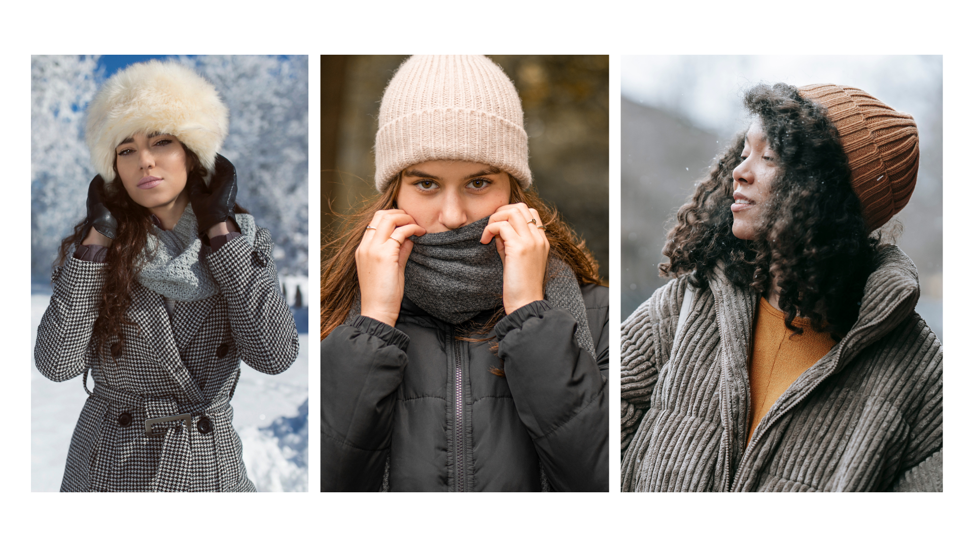
While it’s true that winter collections often favor dark colors, there’s no rule saying you must wear them exclusively, especially if your color type demands lighter colors.
“Bright colors don’t work in winter.”
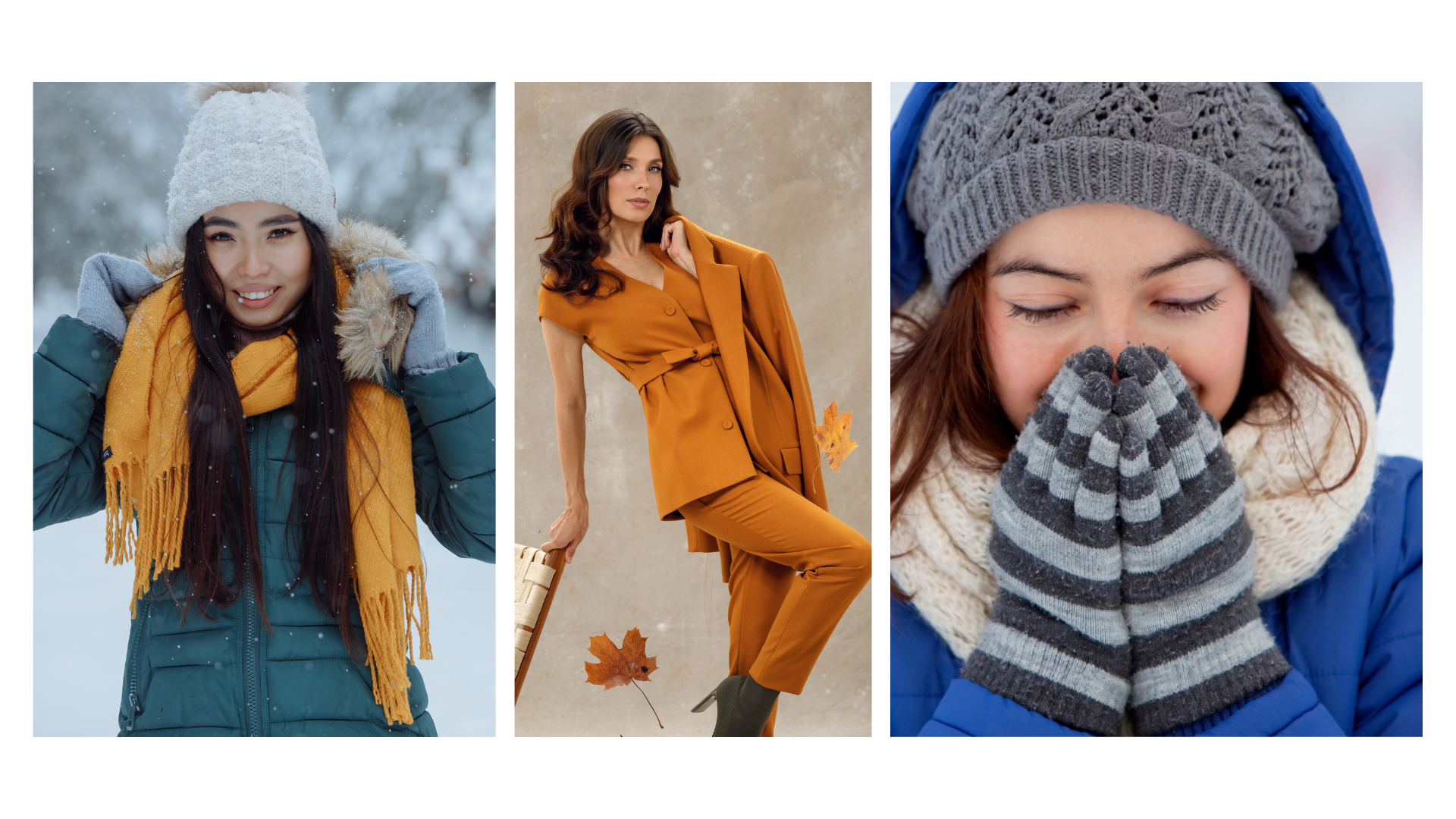
Thoughtfully chosen brighter colors can bring warmth and energy to your look without overpowering you.
“Black is always flattering.”
Black works for some but can drain color from others, especially in low winter light.
Black is not a universal color that anyone can wear.

The 3 Mistakes You’re Making Right Now
1 Wearing Colors That Don’t Match Your Root Skin Color.
Without knowing your Root Skin Color, you will pick shades that clash with your natural coloring, making you appear tired or older.
Especially in winter, it is crucial to know your perfect hues/frequencies to warm up your complexion since in colder temperatures the body reacts differently to the environment than in summer, for 2 reasons:
1 Body Function
In cold conditions, the body prioritizes keeping its core temperature stable to protect vital organs to conserve heat. The bluish tint is primarily caused by a reduction in oxygenation of the blood in superficial vessels. The skin’s thinness in areas like lips and fingertips plays a role in amplifying this effect.
2 Skin´s Interaction With The Visible Light Spectrum During Winter
Lower Sunlight Intensity
In winter, the sun sits lower in the sky, reducing overall light intensity and altering the balance of wavelengths that reach the Earth.
With the sun lower, the atmosphere scatters shorter wavelengths of light (blue and violet) more effectively, leading to a cooler-toned ambient light.
Red and infrared light, which provide warmth and a flattering glow to the skin, are less intense in winter.
Skin absorbs and scatters light differently depending on its layers:
The outermost layer (epidermis) interacts with shorter wavelengths like blue light.
The dermis, which contains blood vessels, reflects longer wavelengths like red and infrared light.
During cold exposure, vasoconstriction reduces the amount of oxygen-rich blood near the skin’s surface. This decreases red light reflection, making blue wavelengths more noticeable.
Without as much red light reflection, skin appears cooler and sometimes bluish or grayish in tone.
Effect of Diffused Light
Winter light is often diffused due to overcast skies and snow, which scatters blue wavelengths further.
The lack of strong direct sunlight reduces natural highlights, flattening the appearance of the skin.
Snow reflects up to 80% of the ambient light, amplifying the cool blue tones and reducing warm hues in the environment.
Optical Properties of Skin in Winter
Skin that has become paler due to reduced sun exposure during winter reflects more of the ambient light, including the cooler blue wavelengths.
In areas with thinner skin (like lips and fingertips), light penetrates deeper, interacts with deoxygenated blood, and reflects more of the cooler tones.
Choosing the wrong colors in winter increases the dissonance even more and you look more dull or sick.

2 Defaulting to Monochromatic Outfits.
While these can look chic, relying too heavily on black or gray creates a flat and uninspired look, especially if your color type is not aligned with those colors.
Creating stunning monochromatic outfits requires knowing your contrast type to avoid looking washed out or overpowered.

3 Ignoring Accessories as a Way to Add Color
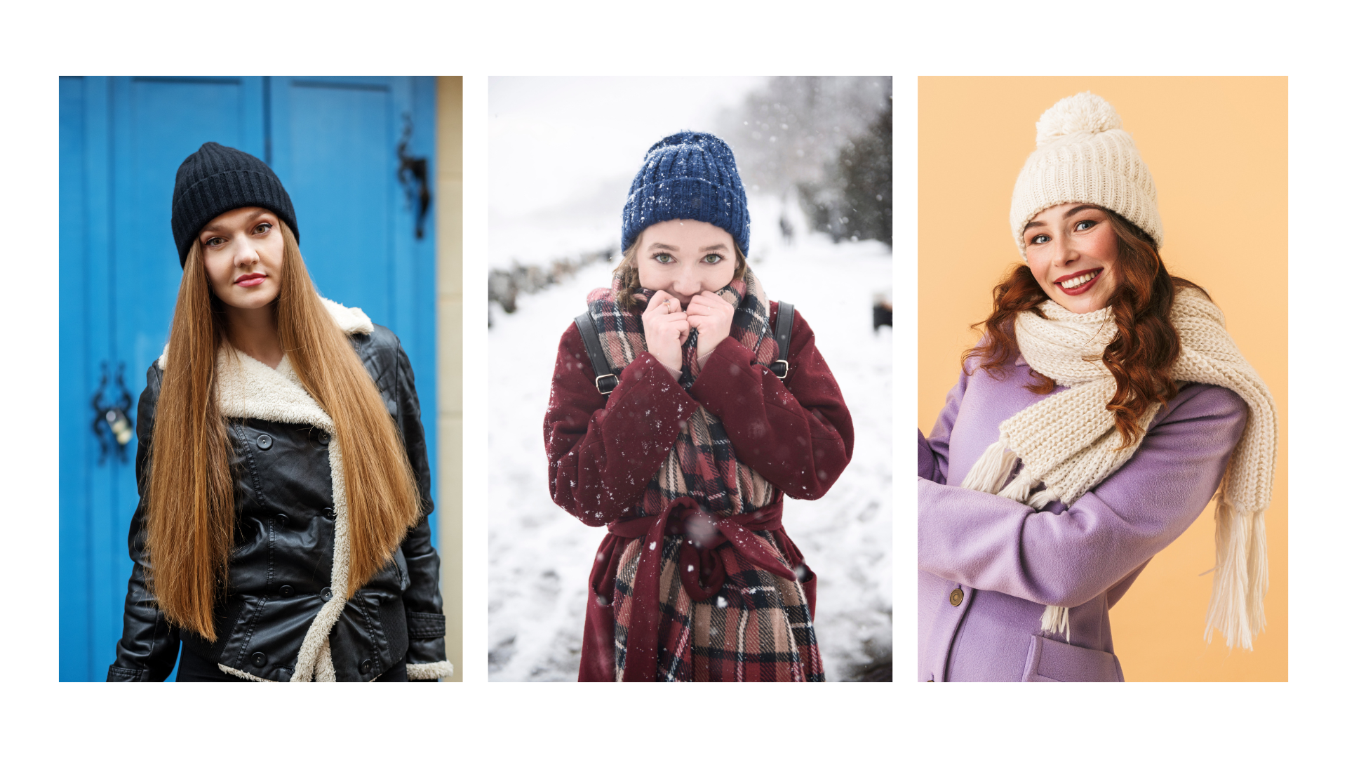
Winter accessories like scarves, hats, and gloves are easy opportunities to introduce flattering colors, yet they’re often overlooked or mismatched.
I see many women choose overpowering colors, too bright colors, or too many colors that create a lot of dissonance.

The 60-30-10 Rule
This is a classic design principle applied to fashion that you will hear from stylists:
60%: Dominant color (e.g., a dress, suit, or coat).
30%: Secondary color (e.g., a shirt, pants, or cardigan).
10%: Accent color (e.g., accessories like a scarf, bag, or shoes).

This creates balance while allowing for a pop of interest without overwhelming the look.
This general principle is, however, only aligned with monochromatic color types (brown hair + eyes) as they usually can wear more colors than other color types.
Here is a much better principle to follow if you want to create stunning outfits:
If you are a monochromatic type, you have 1 color in your coloring (hair and eyes) you can wear up to 3 colors.
If you are a multichromatic type, you have 2 or more colors in your coloring (blond hair + blue eyes) you can wear up to 2 colors.
The term color refers to the hue/frequency! If you create a monochromatic outfit it is considered as 1 color which is the most flattering for people who are multichromatic color types.
Use the Color Wheel as a Guide?
Stylists recommend using color theory to select harmonious combinations:
Complementary Colors: Opposite on the color wheel (e.g., blue and orange) for bold contrasts.
Analogous Colors: Next to each other (e.g., blue, teal, green) for a subtle, harmonious look.
Triadic Colors: Three evenly spaced colors (e.g., red, yellow, blue) for a balanced and vibrant style.

Origins of the RYB Color Wheel
The concept of organizing colors in a circular form dates back to Aristotle (4th century BCE) and later Leonardo da Vinci (15th century), who studied the nature of colors and their interactions.
The first formal RYB color wheel was attributed to Sir Isaac Newton in 1704 in his book Opticks. Newton arranged colors from the spectrum into a circular diagram, but his work focused on light (ROYGBIV) rather than pigments.
Johann Wolfgang von Goethe (1810):
Goethe expanded on Newton’s ideas in his Theory of Colours, focusing on how humans perceive color. He emphasized the RYB model for its practical application in art.
Moses Harris (1766):
Harris, an English entomologist and artist, created one of the first pigment-based color wheels in RYB, blending primary colors to produce secondary colors (green, orange, purple).
It is crucial to understand that these concepts are not equal to how human coloring is created and maintained; and how the human skin interacts with the visible light spectrum!
This means that the classical RYB color wheel cannot be used to create color combinations for humans.
Let Color Work For You, Not Against You
Imagine a winter wardrobe filled with colors that make you glow, even on the grayest of days. It’s possible when you understand your unique Root Skin Color and use it as the foundation for your clothing choices.
Explore Custom Premium Wardrobe Palettes To Elevate Your Radiance
Limited Seats!
*eR 🌸
